Gday, I am building a site for my writings and cannot decide on the format for the Home Page.
I can keep it simple, like this...
Or make it more 'magazine-style' like this...
https://wol223.wixsite.com/sasquatchsagas
Which one makes you want to read more?
Thanks in advance.
Opinions/critiques wanted please...
-
Wolf
- Long Time Contributor
- Posts: 1572
- Joined: Thu Feb 04, 2016 10:46 pm
- Position: Artist
- Facebook Profile Page: https://www.facebook.com/groups/266070257413290/
- Contact:
Opinions/critiques wanted please...
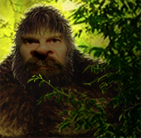
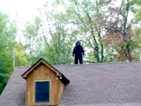
You do not have the required permissions to view the files attached to this post.
The mightiest oak was once a nut that stood his ground https://www.sasquatchstories.com
-
Simon M
- Long Time Contributor
- Posts: 900
- Joined: Sun Sep 11, 2016 1:36 am
- Position: Unsure
- Location: Mostly at home
Re: Opinions/critiques wanted please...
I can't see the link to the first presentation style, but that magazine layout looks excellent to me. 
-
Wolf
- Long Time Contributor
- Posts: 1572
- Joined: Thu Feb 04, 2016 10:46 pm
- Position: Artist
- Facebook Profile Page: https://www.facebook.com/groups/266070257413290/
- Contact:
Re: Opinions/critiques wanted please...
Thanks SImon, that's one vote for magazine style layout.
For some reason I cannot link the first option. The text is pretty much the same as in the linked page (second option).
My son reckons its all too 'old school'.
For some reason I cannot link the first option. The text is pretty much the same as in the linked page (second option).
My son reckons its all too 'old school'.
The mightiest oak was once a nut that stood his ground https://www.sasquatchstories.com
-
ChrisV
- Long Time Contributor
- Posts: 625
- Joined: Mon Nov 10, 2014 3:28 pm
Re: Opinions/critiques wanted please...
I think the second example looks best. Its a little more exciting .
-
Dion
- Forum Moderator
- Posts: 2177
- Joined: Sat Jan 15, 2005 1:44 pm
- Position: Researcher
Re: Opinions/critiques wanted please...
Hey Wolf
I dont see much difference other than the second one has a few more pictures, for a 'Home page' this is precisely what you would want to draw the eye in and get peoples attention.
The second layout is fine and is probably what I would choose, I would just smarten it up a bit make it a bit cleaner like the first one.
Hope that makes sense.
Either way good luck.
“The day science begins to study non-physical phenomena, it will make more progress in one decade than in all the previous centuries of its existence.” - Nikola Tesla
User formally known as chewy
User formally known as chewy
-
Searcher

- Long Time Contributor
- Posts: 847
- Joined: Thu Mar 20, 2014 12:18 pm
Re: Opinions/critiques wanted please...
The magazine style is definitely more attention grabbing. It holds more interest. Look forward to seeing it up and running!
-
Rusty2
- Long Time Contributor
- Posts: 1784
- Joined: Mon Aug 23, 2010 5:30 pm
- Position: Believer
- Location: East Coast
Re: Opinions/critiques wanted please...
Oooh , the second one looks better for some reason , good luck with it Wolf !
-
paulmcleod67
Re: Opinions/critiques wanted please...
Option A mate looks more inviting.Wolf wrote:Gday, I am building a site for my writings and cannot decide on the format for the Home Page.
I can keep it simple, like this...
Or make it more 'magazine-style' like this...
https://wol223.wixsite.com/sasquatchsagas
Which one makes you want to read more?
Thanks in advance.
Where and when can I buy the book.....gimme gimme gimme.
Cudo's matey
-
Yowie bait
- Long Time Contributor
- Posts: 2530
- Joined: Wed Jan 13, 2016 5:06 pm
- Position: Believer
Re: Opinions/critiques wanted please...
I like the top one best. The first book was excellent. 
Yowie Bait
-
Shazzoir
- Long Time Contributor
- Posts: 1236
- Joined: Sat Nov 19, 2005 12:40 pm
- Position: Crypto Enthusiast
- Gender: Female
- Location: Brisbane, Qld
Re: Opinions/critiques wanted please...
They are both good, but the first option presents a 'wall of text' which will deter some people from going further and reading what you have to say.
The second option is MUCH easier on the eye, it also breaks up the 'wall' of text into bite-sized paragraphs, which is what you want. It looks less intimidating to read, forces/persuades the eye to move across the page, which as others have already stated, brings interest and energy to the page and its contents.
Variety of image then text is what I would suggest works best, just be wary of making the text too small. What you have there already looks fine, but I wouldn't go any smaller.
Similarly, it's always good to avoid using too many different fonts - One is fine, two is acceptable. Any more than two is pushing it, but you can sometimes get away with using italics for interest, rather than a third font.
Don't go for big splashy fonts in multiple colours - stick to a colour scheme, as you have done. White always wins on a dark bacground, just make sure if you put text over paler images, that you may need to use black rather than white.
Excellent work Wolf.
Shazz
Absence of evidence is not evidence of absence. Dr. Carl Sagan
-
Doorway

- New Member
- Posts: 29
- Joined: Sun Jun 26, 2016 12:11 pm
- Position: Researcher
Re: Opinions/critiques wanted please...
I like the 2nd one Wolf.
Good luck with it.
Good luck with it.
-
Wolf
- Long Time Contributor
- Posts: 1572
- Joined: Thu Feb 04, 2016 10:46 pm
- Position: Artist
- Facebook Profile Page: https://www.facebook.com/groups/266070257413290/
- Contact:
Re: Opinions/critiques wanted please...
Yeah, it's a work in progress.Dion wrote:... I would just smarten it up a bit make it a bit cleaner like the first one.
Hope that makes sense...
Thanks everyone for your input
The mightiest oak was once a nut that stood his ground https://www.sasquatchstories.com
-
Wolf
- Long Time Contributor
- Posts: 1572
- Joined: Thu Feb 04, 2016 10:46 pm
- Position: Artist
- Facebook Profile Page: https://www.facebook.com/groups/266070257413290/
- Contact:
Re: Opinions/critiques wanted please...
I've been having fun animating the page elements... https://wol223.wixsite.com/sasquatchsag ... creek-1967
What do you guys think?
What do you guys think?
The mightiest oak was once a nut that stood his ground https://www.sasquatchstories.com
-
Simon M
- Long Time Contributor
- Posts: 900
- Joined: Sun Sep 11, 2016 1:36 am
- Position: Unsure
- Location: Mostly at home
Re: Opinions/critiques wanted please...
That's really good!
-
David
- Long Time Contributor
- Posts: 744
- Joined: Sat Oct 01, 2011 11:16 am
- Position: Nature Lover
- Location: ACT
Re: Opinions/critiques wanted please...
Number 2 Wolf.. I think photos breaking up the content on websites is far more interesting than block text. Just looks more appealing and makes you want to read the accompanying text. Good luck.
-
Wolf
- Long Time Contributor
- Posts: 1572
- Joined: Thu Feb 04, 2016 10:46 pm
- Position: Artist
- Facebook Profile Page: https://www.facebook.com/groups/266070257413290/
- Contact:
Re: Opinions/critiques wanted please...
Thanks everyone, I will go with the magazine-look approach.
I have used it for one of the 'sasquatch science articles too...
https://wol223.wixsite.com/sasquatchsag ... kull-found
I have used it for one of the 'sasquatch science articles too...
https://wol223.wixsite.com/sasquatchsag ... kull-found
The mightiest oak was once a nut that stood his ground https://www.sasquatchstories.com
-
hillbilly

- Gold Status - Frequent Poster
- Posts: 265
- Joined: Wed Jun 01, 2005 11:35 am
- Position: Believer
- Location: Blue Mountains
Re: Opinions/critiques wanted please...
Yes, ...all good points.Shazzoir wrote:They are both good, but the first option presents a 'wall of text' which will deter some people from going further and reading what you have to say.
The second option is MUCH easier on the eye, it also breaks up the 'wall' of text into bite-sized paragraphs, which is what you want. It looks less intimidating to read, forces/persuades the eye to move across the page, which as others have already stated, brings interest and energy to the page and its contents.
Variety of image then text is what I would suggest works best, just be wary of making the text too small. What you have there already looks fine, but I wouldn't go any smaller.
Similarly, it's always good to avoid using too many different fonts - One is fine, two is acceptable. Any more than two is pushing it, but you can sometimes get away with using italics for interest, rather than a third font.
Don't go for big splashy fonts in multiple colours - stick to a colour scheme, as you have done. White always wins on a dark bacground, just make sure if you put text over paler images, that you may need to use black rather than white.
Excellent work Wolf.
Shazz
What she said, well done Wolf.
-
Austral
- Silver Status
- Posts: 141
- Joined: Tue Nov 28, 2017 7:10 am
Re: Opinions/critiques wanted please...
Wolf wrote:Thanks everyone, I will go with the magazine-look approach.
I have used it for one of the 'sasquatch science articles too...
https://wol223.wixsite.com/sasquatchsag ... kull-found
Kow Swamp is near Leitchville, Victoria and the skulls were found in the 1970's .
-
Wolf
- Long Time Contributor
- Posts: 1572
- Joined: Thu Feb 04, 2016 10:46 pm
- Position: Artist
- Facebook Profile Page: https://www.facebook.com/groups/266070257413290/
- Contact:
Re: Opinions/critiques wanted please...
Thanks mate.Austral wrote:Wolf wrote:Thanks everyone, I will go with the magazine-look approach.
I have used it for one of the 'sasquatch science articles too...
https://wol223.wixsite.com/sasquatchsag ... kull-found
Kow Swamp is near Leitchville, Victoria and the skulls were found in the 1970's .
Your comment made me do some more research... Apparently the Pintubi1 skull was found in the Lower Darling River NSW, not Kow swamp as other resources suggested.
The mightiest oak was once a nut that stood his ground https://www.sasquatchstories.com
-
Austral
- Silver Status
- Posts: 141
- Joined: Tue Nov 28, 2017 7:10 am
Re: Opinions/critiques wanted please...
Yeah, me and the old man went for a look when they dug them up and they'd been buried and not just died there.
A local farmer brought one of the skulls to school for us kids to look at and that one had over sized canines and heavy brow.
Years later i saw pictures of the Kow Swamp skulls at a museum and they weren't the same skulls.
Also, the Aboriginies from Echuca claimed them as there assentors and took them somewhere ?